To use this site, please disable the ad blocking feature and reload the page.
This website uses cookies to collect information about your visit for purposes such as showing you personalized ads and content, and analyzing our website traffic. By clicking “Accept all,” you will allow the use of these cookies.
Users accessing this site from EEA countries and UK are unable to view this site without your consent. We apologize for any inconvenience caused.
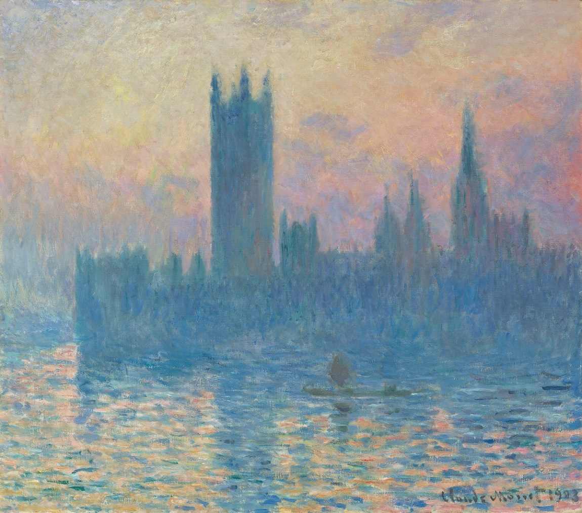
Courtesy of National Gallery of Art, Washington Claude Monet’s “The Houses of Parliament, Sunset,” from 1903.
By Sebastian Smee / The Washington Post
13:43 JST, February 3, 2023
If you study science – and I haven’t since high school, so bear with me – you probably understand that correlation is not the same as causation. Just because two phenomena seem to be connected doesn’t mean that one caused the other. So when you read, in reports about a recent study getting considerable attention, that the increasing lack of definition in the art of J.M.W. Turner and Claude Monet correlates with an increase in air pollution during the Industrial Revolution, you might think: Wait.
You might also think, I wonder if anyone has thought this before? The answer is: Of course they have. It’s commonplace in the literature on both Turner and Monet to link their visions with aspects of modernity, including human-made pollution. “Turner Whistler Monet,” a 2005 exhibition at Tate Britain in London, even organized a conference around “the aesthetics of pollution,” which discussed the idea that all three artists might have been provoked by pollution to abandon realism and seek out beauty in the modern urban environment.
So the connection is there, and it’s valid. But to suggest that the increasing radicalism of Turner and Monet – their willingness to jettison clear outlines and old ways of painting – was the result of increased levels of sulfur dioxide in the atmosphere is to confuse internal creative choices with external stimuli.
According to atmospheric scientist Anna Lea Albright, lead author of the study, published Tuesday in the Proceedings of the National Academy of Sciences, a team of researchers examined 60 paintings by Turner from 1796 to 1850 and 38 paintings by Monet from 1864 to 1901. It found that over time, as industrial air pollution increased throughout Turner and Monet’s careers, skies in their paintings became hazier, too. More specifically, researchers found that around 61 percent of the contrast changes in the paintings largely tracked with increasing sulfur-dioxide concentrations during that time period.
This sounds fascinating and credible, and don’t we all love metrics. But it’s terribly facile.
The study compares Turner’s “Apullia in Search of Appullus,” which he painted in 1814, with “Rain, Steam, and Speed – The Great Western Railway,” painted 30 years later. The first picture has clear skies and distinct objects. In the second, hazy skies dominate. During the 30 years separating the two works, according to the study, sulfur-dioxide emissions more than doubled.
But we’re comparing apples and fuzzy peaches here. The first work was never trying to be a picture of objective reality. It’s a mythological painting inspired by Ovid and based on a composition by the 17th-century painter Claude Lorrain. Folks, it’s a fiction.
Despite featuring a steam train, so is the second picture. The title tells you what you need to know: It is a picture that tries to capture, all at once, bad weather, steam from a train and rapid movement. Not ambient air pollution. Rather than a documentary picture, it is an example of full-blown Romanticism, which in this context we might think of as the elevation of feeling and movement over stability and decorum.
Turner was engaged with modernity. And yes, air pollution in England may have affected his poetic vision. But he was also an obsessive traveler. Many of the changes in his art had to do with his experiences in the Alps, in the Scottish Highlands and lashed to the masts of ships at sea. These are the places he loved, in part because of their rapid and often acute changes in weather. They are where you experience sea spray and storms and dramatic changes in light conditions, particularly around sunset and sunrise, times Turner loved – not only visually but for their poetic associations. (A setting sun, for instance, might conjure the end of an empire; sunrise, the dawn of a new age).
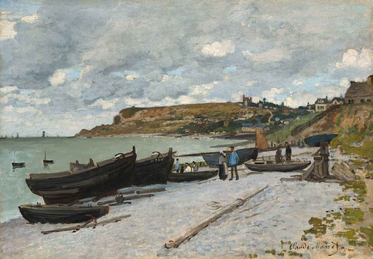
Courtesy of National Gallery of Art, Washington Claude Monet’s “Sainte-Adresse,” from 1867.
As for Monet, if the argument that increased air pollution provoked changes in his style holds, how are we to explain that his work gets most loose and brushy, his outlines least distinct, after he moves to Giverny, France, and paints waterlilies and bridges in his garden? Was there more air pollution in Giverny than in London? No. What was happening instead is that Monet’s painting was becoming increasingly poetic, closer and closer to abstraction and to what the critic Walter Pater called “the condition of music.” Something suggestive and abstracted, in other words, with immediate connection to emotions.
Confusing correlation with causation is one problem; the cherry-picking of evidence is another. The study notes that Monet’s “Sainte-Adresse,” painted in 1867, heavily contrasts with his “Houses of Parliament” series, begun around 1899, which encourages the authors to try to draw conclusions about levels of sulfur dioxide in the air.
It would have been less spurious to compare Monet’s paintings from London in 1870-1871, when he escaped the Franco-Prussian war, with his 1899 paintings of the same city. Comparing a coastal picture which is, at best, proto-Impressionist, with a fully Impressionist depiction of polluted London makes little sense, since there will almost always be less pollution on the coast.
One of the study’s approaches was to measure the distance at which objects can be clearly seen in the paintings of Turner and Monet. It found that visibility in Turner’s clear-sky and cloudy paintings before 1830 averaged about 25 kilometers (15.5 miles) but decreased to 10 kilometers after 1830. In several of Monet’s Charing Cross Bridge paintings, the farthest visible object was estimated to be about 1 kilometer away.
That’s great. But here’s another way of looking at Monet. As he aged, what absorbed the Frenchman more than anything was change. Transience. He found himself painting not so much the relatively unchanging objects before him (cliffs, cathedrals, bridges, haystacks) but the forever changing envelope of atmosphere around them. He painted the air between him and the objects. So yes, when he painted London, Paris and Rouen, France, of course he was painting air pollution, just as he loved painting spray and mist when he was on the wild Atlantic coast.
But given that he made the artistic decision to paint the envelope of air around things rather than the things themselves, does it make any sense to track changes in visible distance and draw conclusions about air pollution? Not really. The pertinent change is not the air pollution but the artist’s aesthetic choice.
The study also claims to have used a mathematical model to look at how sharp the outlines of objects in Monet’s and Turner’s pictures were in relation to their backgrounds. Less contrast, they decided, meant hazier conditions. Increased use of white hues, they also decided, indicated greater intensity of haze (and therefore pollution).
But who says whiter hues indicate more intense haze? How do we know they don’t indicate a desire to brighten up pictures – to get away from the “brown sauce school” that the new painters who revered Édouard Manet were so keen to leave behind? Increased light, after all, is a hallmark of Impressionism.
Likewise, air pollution may be one cause of fewer sharp outlines in certain Monet paintings. But more likely causes for the general changes in his style can be found by looking to art history, which, if you’re a serious painter, is as palpable and present as the air around you.
Monet wasn’t a recording machine. He was a painter emerging from a long tradition. At the heart of that tradition, going right back to the Renaissance, was a debate about the relative merits of line and color. Should drawing and composition be the foundation of great painting, as the artists of the Florentine Renaissance argued, or should the colored pigments of paint be prioritized? The artists of the Northern Renaissance had shown that oil paint, abetted by colored glazes and varnish, had an almost miraculous ability to create realistic atmospheres and textures.
Learning from these northerners, Venetian painters such as Titian and Tintoretto were particularly brilliant at approximating the way the eye actually sees: not with allover focus and precision but with a great deal of guesswork and inference. They left out details and blurred outlines, letting the viewer’s eye do more of the work of completing the picture. This felt truer to the mobility and flexibility of human vision. And it stimulated different kinds of poetic response.
In subsequent centuries, one tradition of European artists insisted on the primacy of drawing, composition and smooth finishes. (The key figures were Poussin, David and Ingres). Another school celebrated color and open brushwork, emphasizing texture, touch and movement. (The key figures were Rubens, Velazquez, Frans Hals and Delacroix.) Turner and Monet, though very different artists, were the progeny of the artists in this second tradition, none of whom were flirting with indistinct and atmospheric styles because of air pollution.
There are many reasons the look of pictures changes. Monet was famous for his desire to depict the world as he saw it, but you cannot read even his work as a straightforward index to external conditions such as pollution levels. Paintings are not like tree rings or geological studies. They are complex products of human imagination, feeling and philosophy.
So, I’m not arguing that there is no credence to the already well-established idea that Monet was responding to an increasingly polluted environment. I’m just arguing that this latest study’s way of making the case is so full of holes that it strikes me as worthless.
It mistakes correlations for causes. It is grossly (and trendily) tendentious. And it ignores whole bodies of exhaustively researched and powerfully argued literature, presumably because that literature falls under the category of the “humanities” rather than the “sciences,” and because no one these days can be made to believe anything that doesn’t have metrics attached.